


Baseball Uniform Tragedies and Triumphs
A Brief and Curated History of Baseball Fashion Over The Years


As you may have heard, there’s been a major uniform kerfuffle in MLB this year, as the suppliers Nike and Fanatics have rolled out new jerseys and pants to near universal disapproval among fans and players alike.
A quick rundown of the major gripes with the new uniforms:
smaller lettering for team and player names
see through baseball pants that players also say aren’t as comfy
Glaring sweat stains, that cause mismatching colors
These new changes make the uniforms look cheap and amateurish compared to what existed previously. When this controversy all started to boil over in spring training, Nike issued a statement defending their changes, saying they wanted to “create the most advanced uniforms in the history of MLB which are lighter and more flexible.”
Now look, this is very on-brand for Nike, a visionary company that made its name on bold, innovative designs like Air Jordan sneakers; but for this very reason, they seem to be ill suited to be the supplier for MLB. Baseball uniforms are charming because they aren’t “advanced” - they’re old fashioned!
The blowback has been swift and relentless, and fortunately, the MLB announced recently that they would fix the most egregious issues in the coming months.

But while these tweaks have rightly received the bulk of the negative attention this season, equally as notable under Nike’s direction have been the new ‘City Connect’ uniforms that MLB teams have rolled out the past couple of years, which aim to “highlight the cultural aspects of each Major League Baseball team's home city through new, colorful jerseys.”
Or in my view: a relatively earnest, but ultimately misguided attempt to make baseball “cooler;” the baseball equivalent of the famous Steve Buscemi-meme, if you will (it doesn’t hurt that now teams can sell even more merchandise either, of course).
:format(webp)/cdn0.vox-cdn.com/uploads/chorus_asset/file/8846551/Screen_Shot_2017_07_13_at_1.09.20_PM.png)
Nothing screams desperation like the new Rays City Connect jerseys, which are made of an iridescent material and feature hotrod-like flames on the lettering and bright neon colors. But the cherry on top has to be the logo patch on their pants, featuring a manta ray riding a skateboard, representing the “intrinsic link between skateboarding and baseball.”
Maybe I’m an idiot, but I am unaware of this connection between the two, and yes - that is a cartilaginous fish riding a deck, surrounded by iridescence and flames.
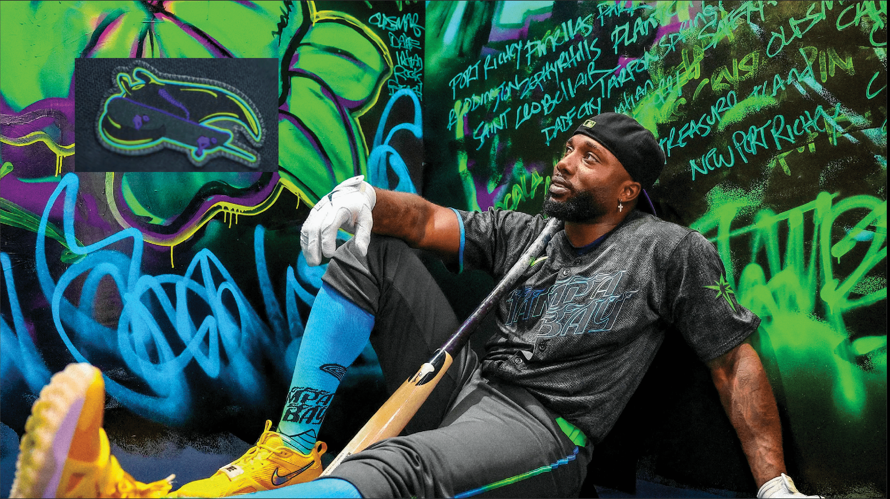
In fairness, the Rays have a better claim to neon, irreverent imagery than most MLB clubs (more on that later), which is why I’m reserving the right to do a complete 180 on these jerseys.
But they’re hardly alone in introducing cringe-worthy City Connect jerseys. Some of my least favorites are Philadelphia’s and Detroit’s:

There’s way too much going on here: the color gradients are distracting, Philly’s font and Detroit’s tire “tread marks” are both trying way too hard, and something about the plainness of Detroit’s hat bothers me.
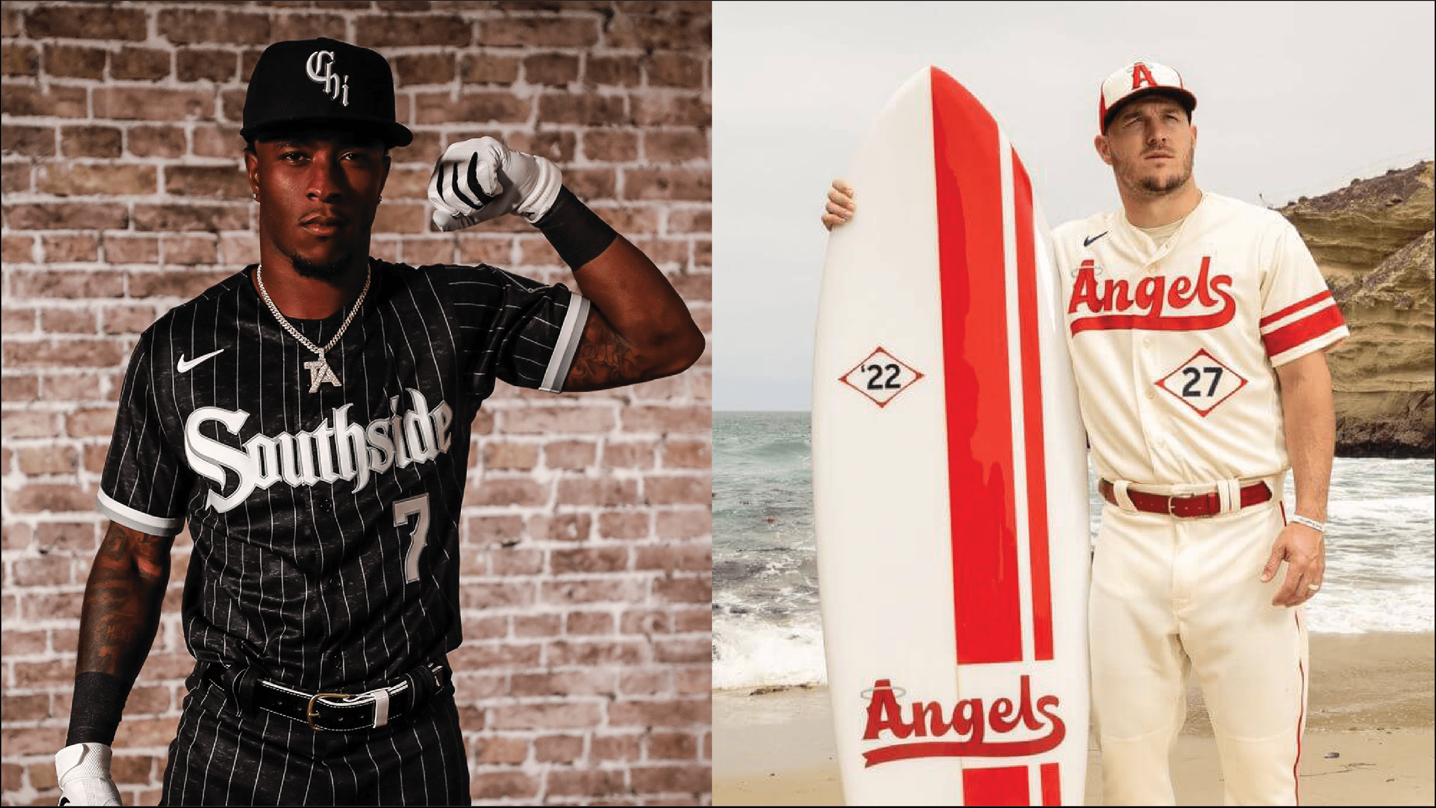
Still, there have been some handsome designs to come out of the campaign, like the White Sox’s and Angels’ designs:
And to prove that I’m not just grumpy and traditional, I really like the Padres’ and Marlins’ colorful uniforms:

Beginnings
But when did all this uniform shuffling start?
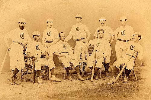
By and large, teams wore their traditional colors and uniforms for the first century or so of the sport’s existence (1860-1960), with some notable innovations.
Baseball uniforms actually predate photography, but some early uniform advancements include the Cincinnati Reds experimenting with “knickers” - or baseball pants as we now know them - in 1867. Or in 1888 when teams in Washington, Detroit, and Brooklyn first debuted pinstriped uniforms, a pattern so common across the league today.
Things really started to take shape in the early years of the 20th Century, when the Tigers introduced their old English letter “D'“ logo in 1904 (the oldest MLB logo still in use) and the pinstriped-Yankees and the red socked-Red Sox took form in 1912.

These changes don’t appear to have been met with the same level of passion and vitriol that some later jersey tweaks would inspire in fans.
One of the few early uniform controversies occurred in 1938 when the Philadelphia Phillies switched from their red and white color scheme, to blue and yellow.
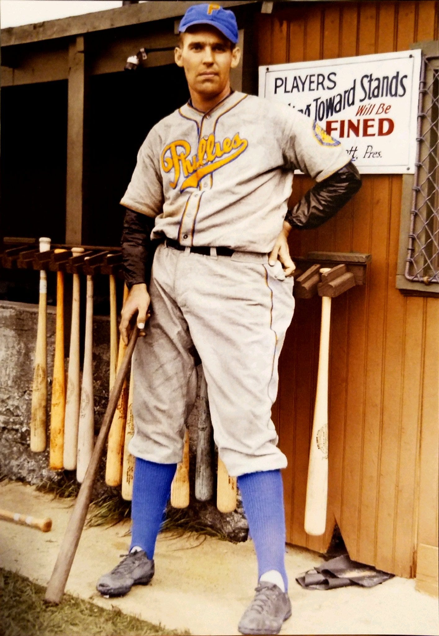
This was ostensibly to celebrate the 300 year anniversary of New Sweden (never heard such a place before) - which had a blue and yellow flag and occupied a strip of land along the border of modern-day Pennsylvania, Delaware, and New Jersey in the 1600s - but the change also coincided with a lull in fan interest; so this could be the first modern (ish?) example of a team rolling out new uniforms to gin up attention.
Fans didn’t care for them, and the team quickly returned to their classic color scheme after the season. I think they looked pretty good… certainly better than their new City Connects!
The 60s and 70s
The craziest and most lovable era of baseball uniforms has to be the late 60s and 70s - beginning with the Athletics when they moved from Kansas City to Oakland in 1968 and first sported their iconic green and yellow uniforms.
These were louder than anything baseball had seen before, and soon other teams followed suit with unconventional, and often garish designs.
Some good…some not so good… but all bonkers!

These Padres and Astros jerseys are undeniably out there, and yet… they kind of work?

The 70’s wackiness extended to teams’ headwear. The Pirates and Mariners wore two of the crazier designs.

And of course, there were the notorious White Sox uniforms featuring shorts…

While some of these designs have hung around - like the A’s (for now…) - for the most part, these loud uniforms receded into the past as America moved on from the zany excess of the 1970s.
The 90s - Expansion
The last wave of innovation that actually moved the ball forward occurred in the 90s, when we saw the best and worst when it comes to uniform design.
The MLB welcomed four new clubs in the 90s: The Marlins, Rockies, Diamondbacks, and Devil Rays. All of these teams embodied that undeniably 90’s color palette featuring bright pastels (except the Rockies, who have always worn incredibly forgettable, bland uniforms - thus I am ignoring them from this point onwards).

At the time, the reaction to many of these designs were mixed at best - but in my eyes, they’re are all gems (I especially loved the Devil Rays logo as a kid).
Over the years, affection for these uniforms has grown, yet sadly they weren’t able to endure their initial unpopularity long enough to become classics.
Thus, none are still in regular use today - even as two of the three teams won World Series wearing these same uniforms (the Marlins in ‘97 & ‘03 and the D Backs in ‘01).
The 90s - Turn Ahead The Clock
On the flip side, arguably the most infamous uniform campaign came in 1999, when MLB featured “Turn Ahead The Clock” games. Fueled by turn-of-the-millennium verve and the usual anxiety about the game falling out of favor amongst American youths - MLB staged futuristic games, imagining what ballgames would look like in the then far off year of… 2021!
The games featured interplanetary ballpark ads, and some truly bizarre uniforms. Mechanical birds sitting on a metal bar for the Cardinals, an extraterrestrial Mets team; but mostly, teams opted for just a supersized logo smeared across their jersey - which isn’t really futuristic, its just lazy.
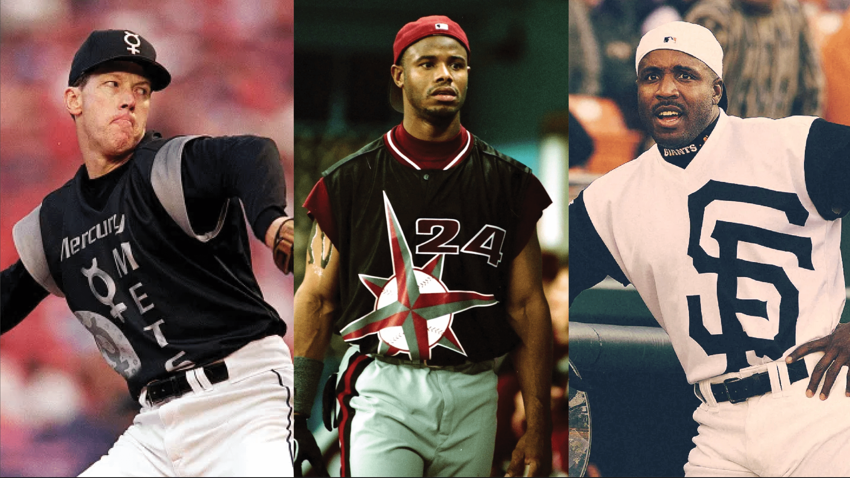
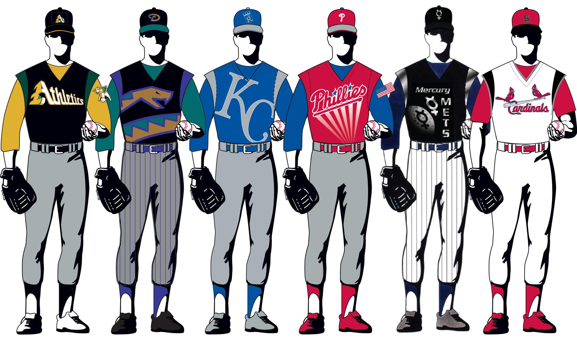
The reaction was fast and swift. Everyone hated the campaign: the fans, the media, and the players especially - who felt they looked more like circus performers than ballplayers. And while I really do admire the novelty of the campaign, the execution was poor and the event deserved the scorn it received.
Last At-Bats
So what do we make of all this?
First, it’s pretty clear that while people generally struggle with change, baseball fans really don’t like it - myself included with a lot of these new City Connect uniforms (I plead the fifth about my Red Sox’s). Thus, most of the notable uniform evolutions over the years have been met with backlash, often so strong that teams quickly retreat to safer waters. Second, it’s also clear that some of this backlash was deserved, while some was born out of obstinance and conservatism.
So is there a way to suss out the difference between an inspired, ahead-of-its-time redesign? And one that is doomed from the start? To me, it comes down to the motivation behind the change.
When one looks at some of baseball’s missteps in this department, the changes are often driven by a fear of being left behind in the dustbin of history; whereas baseball’s best innovations often occur when teams combine their traditions with contemporary elements, and let this fusion guide their aesthetic choices.
Take the two big uniform developments of the 1990s. The reason the expansion teams’ uniforms work for me is because while they went for bold modern colors and designs to make a splash, they also incorporated their regions’ spirit in a smart and tasteful manner. The three teams all hail from the Sunbelt, and thus, feature bright, sunny colors. Furthermore, the Diamondback’s turquoise is also a traditional stone of the Southwest, and the Marlins’ teal comes from Florida’s tropical waters and the fish itself, of course.
On the flip side, the Turn Ahead The Clock designs were, first and foremost, motivated by some vague desire to be cutting edge and often had no connection with franchises’ cities or histories; there is nothing tying the New York Mets to Mercury, as far as I can tell.
To bring it all back to the City Connect uniforms, one can use this same test to assess the uniforms. Some that directly tie into the franchise’s ethos, like the Angels’ SoCal surfer threads, or the Marlins’ Cuban heritage ones work well, while others clearly seem to be grasping .
Rule of Thumb: Go for timeless, rather than timely.
Or if that doesn’t work… dust off those bell bottom jeans, drop some acid, and channel your inner hippie because hot damn, those 1970s uniforms were special!

Thoughts on any of these uniforms? Or are there any you think are particularly memorable ones that I missed?
Send me a message!

Like all the photos, keep em coming. There's a place for timely AND timeless, yin and yang. Some make the cut, and some don't but it's fun to see them side by side.
I like the futuristic big logo Giants jersey…never seen that before. I could do without the City Connects